Visualizing impedance spectra
Plotting a basically formated impedance plot is as easy as 1, 2, 3…
[1]:
import matplotlib.pyplot as plt
import numpy as np

from impedance.models.circuits import CustomCircuit
from impedance import preprocessing
1. Read in data
[2]:
frequencies, Z = preprocessing.readCSV('../../../data/exampleData.csv')

# keep only the impedance data in the first quandrant
frequencies, Z = preprocessing.ignoreBelowX(frequencies, Z)
2. Fit a custom circuit
(If you want to just plot experimental data without fitting a model you should check out the visualization.plot_*() functions)
[3]:
circuit = CustomCircuit(initial_guess=[.01, .005, .1, .005, .1, .001, 200], circuit='R_0-p(R_1,C_1)-p(R_1,C_1)-Wo_1')

circuit.fit(frequencies, Z)

print(circuit)
Circuit string: R_0-p(R_1,C_1)-p(R_1,C_1)-Wo_1
Fit: True

Initial guesses:
    R_0 = 1.00e-02 [Ohm]
    R_1 = 5.00e-03 [Ohm]
    C_1 = 1.00e-01 [F]
    R_1 = 5.00e-03 [Ohm]
    C_1 = 1.00e-01 [F]
  Wo_1_0 = 1.00e-03 [Ohm]
  Wo_1_1 = 2.00e+02 [sec]

Fit parameters:
    R_0 = 1.65e-02  (+/- 1.54e-04) [Ohm]
    R_1 = 5.31e-03  (+/- 2.06e-04) [Ohm]
    C_1 = 2.32e-01  (+/- 1.90e-02) [F]
    R_1 = 8.77e-03  (+/- 1.89e-04) [Ohm]
    C_1 = 3.28e+00  (+/- 1.85e-01) [F]
  Wo_1_0 = 6.37e-02  (+/- 2.03e-03) [Ohm]
  Wo_1_1 = 2.37e+02  (+/- 1.72e+01) [sec]
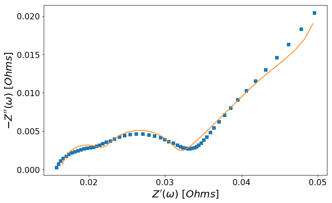
3. Plot the data and fit
a. Interactive altair plot
[4]:
circuit.plot(f_data=frequencies, Z_data=Z)
[4]:
b. Nyquist plot via matplotlib
[5]:
circuit.plot(f_data=frequencies, Z_data=Z, kind='nyquist')
plt.show()
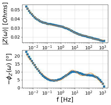
c. Bode plot via matplotlib
[6]:
circuit.plot(f_data=frequencies, Z_data=Z, kind='bode')
plt.show()
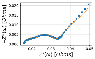
Bonus: Easy access to all the customization of matplotlib
Here we plot the data, changing the size of the figure, axes label fontsize, and turning off the grid by accessing the plt.Axes() object, ax
[7]:
fig, ax = plt.subplots(figsize=(10,10))
ax = circuit.plot(ax, frequencies, Z, kind='nyquist')

ax.tick_params(axis='both', which='major', labelsize=16)
ax.grid(False)

plt.show()